Wednesday 24 October 2012

Animating a walk Cycle - Line Tests

After completing these tutorials over a few days I wanted to make sure I understood the process. In doing so, I found a free 3d modelled character with a character rig and began developing another walk cycle that related more to my butler's personality.


Below are several videos that show the result of the walk cycle sessions.


Left View


Perspective View


Right View

Wednesday 17 October 2012

Mansion Moodboards


After making a mood board for the butler, I moved on to the room where the animation would take place. Because the main character was a butler, the room had to be sophisticated like his master. I began searching for images of mansion rooms with minimal furniture and a door for the butler to exit when his master calls for him.

Because the brief called for one character, the master would have to be included in the animation in some form. While searching for the images, I remembered something my tutor mentioned during a  screening session of animations. It was noted that a character doesn't have to be visually present in an animation to be a part of it, the voice of a character could be used once it was clear who they were. Therefore the rooms' decore would reflect the masters' character and become the character itself.

The next step would be sketching a concept of the room.


Monday 15 October 2012

BUTLER - Character Concepts

Using the mood boards to develop the butler, a basic doll frame was sketched to help with the body type of the character. The head would be narrow with a big jaw, while the upper body would be slim but broad. The legs and arms would be long and narrow while the hands and feet would be large. The fingers would in relation be long. As seen in the image, the lower left body frame illustrates the butlers posture of standing upright so much that his upper body leans back too far.


After sketching the basic frame I tried to decipher how the character would walk. Because the character is sophisticated, an upright walk seemed to fit his persona as well as having his hands folded behind his back to show his chest outward showing his proud nature.

After a short concept of this walk I began focusing on the details of the character. The head as seen below needed to be narrow like his arms and legs while the nose, ears and chin would be large in relation to his large feet and hands. This would show the balance of large and narrow forms throughout the character.


When the final concept was settled on the head of the butler it was time to move on to the rest of the body and his posture. As seen in the sketches below, the butlers clothing has been altered in comparison to the original stereotype. His upper body is clothed with a turtle neck, long sleeve suit with large openings at the sleeves for his big hands. His trousers are very slim but are folded up at the bottom as they are too long for him, while his shoes are large to accomodate his big feet. The shoes are a cross between formal shoes and slightly casual. The shoes represent the mischievous behaviour of his where he finds himself using his masters items when he is not around.  


Friday 12 October 2012

Animated Research Cont... Animated Shorts

Furthering my research in developing the animated short project. I attended an animation screening where the second year animation students were shown several films. These animated shorts were broken down into their basic ideas and concepts. Certain aspects of each animation were also mentioned such as colour choice, perspective, movement, use of sound, the title of the short, scripts, character development and character design.


ROPEDANCER


BALANCE


HILARY


BRITANNIA


Digital Tutors - Animating Walk Cycles

While developing character concepts for the animated chair exercise, I began learning to animate a walk cycle in the Softimage software using the Digital tutors - Animating Walk Cycles tutorials DVD. Below are the results from the several days of sessions.


Thursday 11 October 2012

Character Moodboard

After writing the idea for the animation, a mood board was needed to help in the creation of the main character, the butler. It was relatively hard to find unique imagery of a butler as I wanted this character to have a different look in comparison to the obvious attire of a butler but to still resemble the loyal helpers in some way. As seen in the mood boards, there are several images of Alfred from the Batman franchise. I wanted to see what other artists thought of the character over the years which would help me observe each iteration and allow me to develop my own character.

After finding several images of Alfred, there were a few images of butlers' I found amusing but helpful. Following the research of the butlers themselves, their attire was another aspect that needed attention. As most bulters are loyal servants of their rich masters, most of them are all dressed in sophisticated attire so I began searching for gentleman's formal clothing to see what fashion would be revealed. Several images were used for the mood board which show old illustrations of bulters dressed formally, along with individual shoes, shirts, waistcoats and more.

After locating enough images to create the mood boards, the next step was to sketch a concept of the butler.


Wednesday 10 October 2012

Animated Short Research

For the animated character short, I took sometime coming up with an idea for the animation. I looked at several books and magazines such as Creating Characters with Personality, The Big Book of Character Design, 3D Artist and 3D World Magazine. After several hours of research for inspiration it was noted in the interviews that the each artist was inspired by another story or concept they admired. This lead to the development of their own interpretation of the story or a completely new narrative.


The image above is a spread taken from the November issue of 3D World Magazine. The artist speaks about his inspiration for the short film. 

Chao Ma devised the basic idea after sketching two brothers hunting. 'I became inspired by a chinese ghost story I'd heard since I was very young. I loved the fox's spirit story: a fox who can transform into a pretty woman and seduce men.'

My next step in the animated short process was to watch several animated shorts to help in creating a character and narrative that are both entertaining and humorous.

Project Brief - Animated Short


Characterisation and Motivation

In this exercise you will be given a set of instructions for an animation exercise.

The animation takes place in one setting and you have a fixed viewpoint (theatrical staging) and there should be no cuts – we won’t be exploring film language in this brief.

- A character is sitting on a chair

- The character stands up

- The character walks towards a door in the room and goes out


You will be given on a separate sheet a description of your character and a reason for their action. From this information develop Character Design sheets for your model and your setting. This means designing a character that fits the description and designing a setting for the character. The setting needs to have a chair and a door in it.


Suggestions: 

- Write out a production schedule with rough dates for the various stages.

- Develop a mental image of what your character will look like and make some quick drawings
  exploring your character’s appearance. 

- Draw some sketches of the setting. Draw up a plan view - overhead - to work out the placement of
  doors, windows, furniture etc.

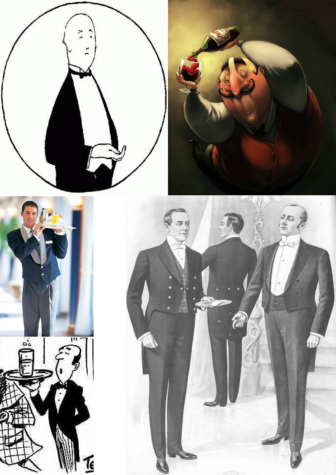
- Do some research.  Find some imagery in books, magazines, internet, real life or wherever and use
these to develop the character further. This can also be useful for deciding what kind of clothes they 
might be wearing and for the design of the setting as well – what kind of room it is, what the furniture is like etc. The idea is to turn your character from a stereotype into a more specific character.

- Having come to a decision about your character, draw up some turnarounds and some emotive
  sheets 
In thumbnail form, draw up the action of the animation.

- Once you’ve worked out in your head and your thumbnails what you want the character to do, draw
  out a layout drawing of what you want your character to do.

- Discuss with the tutors the form that your animation will take e.g. stop-motion; drawn; CGI and so  
  on.

- Animate.

Sunday 7 October 2012

IDENTS - Research (1982 - 1996)


IDENTS

-  a short visual image employed between television programmes that works as a logo to locate the viewer to the channel


Channel 4

Channel Four started on November 2nd, 1982 at 4.40pm with a preview of it's programmes followed by the first edition of Countdown, still running now and the programme that made Richard Whiteley a household name. The channel, at the time a wholly owned subsidiary of the IBA, would aim to increase programming for minority interests and programmes produced by independent producers. Originally funded by the ITV Companies, who were responsible for advertising, Channel Four since 1993 have sold their own advertising.

(http://www2.tv-ark.org.uk/channel4/history.html)
________________________________________________________________________________


1982 - 1994 Idents


The award winning Channel Four identity was designed in 1982 by Robinson Lambie-Nairn. They won the initial pitch against Michael Peters and Wolf Olins. 
  
From their initial presentation Lambie-Nairn researched Channel Four's philosophy and seized the fact that they would be buying all their programmes in, so Channel Four would be a patchwork. 
  
Their first idea was to illustrate the coming together of these elements. The first six ideas of 'coming together' all implied movement. One idea used the the colours of a television gun (RGB) and Channel Four liked the use of strong colour and agreed the 'coming together' theme should be emphasised and developed further. 
  
Having created the logo, Lambie Nairn then used a computer to animate outlines of the blocks to the final freeze. The movements were then hand coloured and shot, but it didnt work, it was lacking shadow and lighting. So they decided to go to Los Angeles and Bo Gehring Aviation who specialised in computer animation to have differing sequences of the same basic symbol done entirely on computer, as at the time there was nowhere in the UK to go for this. 
  
The results were ground breaking, entertaining and a flawless piece of tv graphic design.

(http://www2.tv-ark.org.uk/channel4/1982.html)
________________________________________________________________________________


1996 - 1998 Idents


In the 1990s where 3-D logos are out and 'organic' logos are in, Channel 4 updated its image with a new circle theme. The four circle "connections" design along with its "slice of life" scenarios are the most substantial change to the network's image since its inception in 1982, with the original animated 3D coloured blocks. "Our new look is not about a logo" says C4's marketing director Stewart Butterfield. "We are making a characteristically bold leap beyond the fixation with animated logos, which are beginning to look dated." Work began as a joint project between Tomato and C4's in-house design team. the two went their separate ways in the summer, when C4 decided against the work Tomato presented. Tomato was reported to be "angry" with the decision. The logo and over 100 scenarios were finalised by Electric Image's Inferno operator David Frearson. C4's creative director states that the design needed to be "Fluid and organic... it needs to embody a sense of evolution with wich the audience can share." Electric Image managing director, Paul Docherty acknowledged that these were "difficult concepts to interpret, but David has some ideas for a subtle optical burnout effect that we could produce through the Inferno." Ironically this was the first Electric Image job that did not have a 3D element.


(http://www2.tv-ark.org.uk/channel4/1996.html)

________________________________________________________________________________________


1999 - 2001 Idents


Setting trends in tv branding once again, and Channel Four looks to stripes and the '4' now in a square...

(http://www2.tv-ark.org.uk/channel4/1999.html)
________________________________________________________________________________


2004 - 2007 Idents


(http://www2.tv-ark.org.uk/channel4/2004.html)


Creativepool - Best of Decade. The Channel 4 'Drive-by' Idents


When Channel 4 first played out its new set of channel idents on New Years Eve 2005, the reaction was immediate.

More creative and ambitious than the programmes themselves, the great British public sat open mouthed at the wit, intelligence and pure invention of it all.

Created by Brett Foraker, the then Creative Director of Channel 4 and Russell Appleford of Moving Pictures, the idea was to reveal the C4 logo subtly disguised within various environments and locations. The key element was a first person perspective camera that moved through the sequence to reveal the Channel 4 logo only briefly at the midpoint.

We saw privet hedges gliding over a bowling green, hay bales stacked on a stubbled field, a street market with stalls levitating above our heads, looming pylons trailing from a nuclear power station, road work signs on the motorway and neon hoardings fizzing on the roof an American diner. And somewhere amongst it all was a brief glimpse of the logo itself.

In “Dubai”, for example, the camera pans across a skyline of buildings, with elements from each building representing a piece from the logo. As the camera reaches a certain point, the ‘4’ logo is constructed from those elements for a mere 1/25th of a second before the camera moves on and the image disperses.

“[It was challenging] convincing the powers that be that the logo should only resolve for one frame,” says Foraker. “It was actually quite a conceptual leap. In traditional branding exercises this would be considered heretical but we were convinced we could make this one of the proprietary attributes of the channel.”

The message behind these stunning short films was clear; there are many viewpoints on a subject, but at one point there’s the Channel 4 one. And that was their remit, to approach subjects in a Channel 4 way and offer a different viewpoint.


(http://blogs.creativepool.co.uk/blog/best-of-decade-the-channel-4-%E2%80%98drive-by%E2%80%99-idents/)

________________________________________________________________________________